Loverta Brown Potfolio

Workshop1

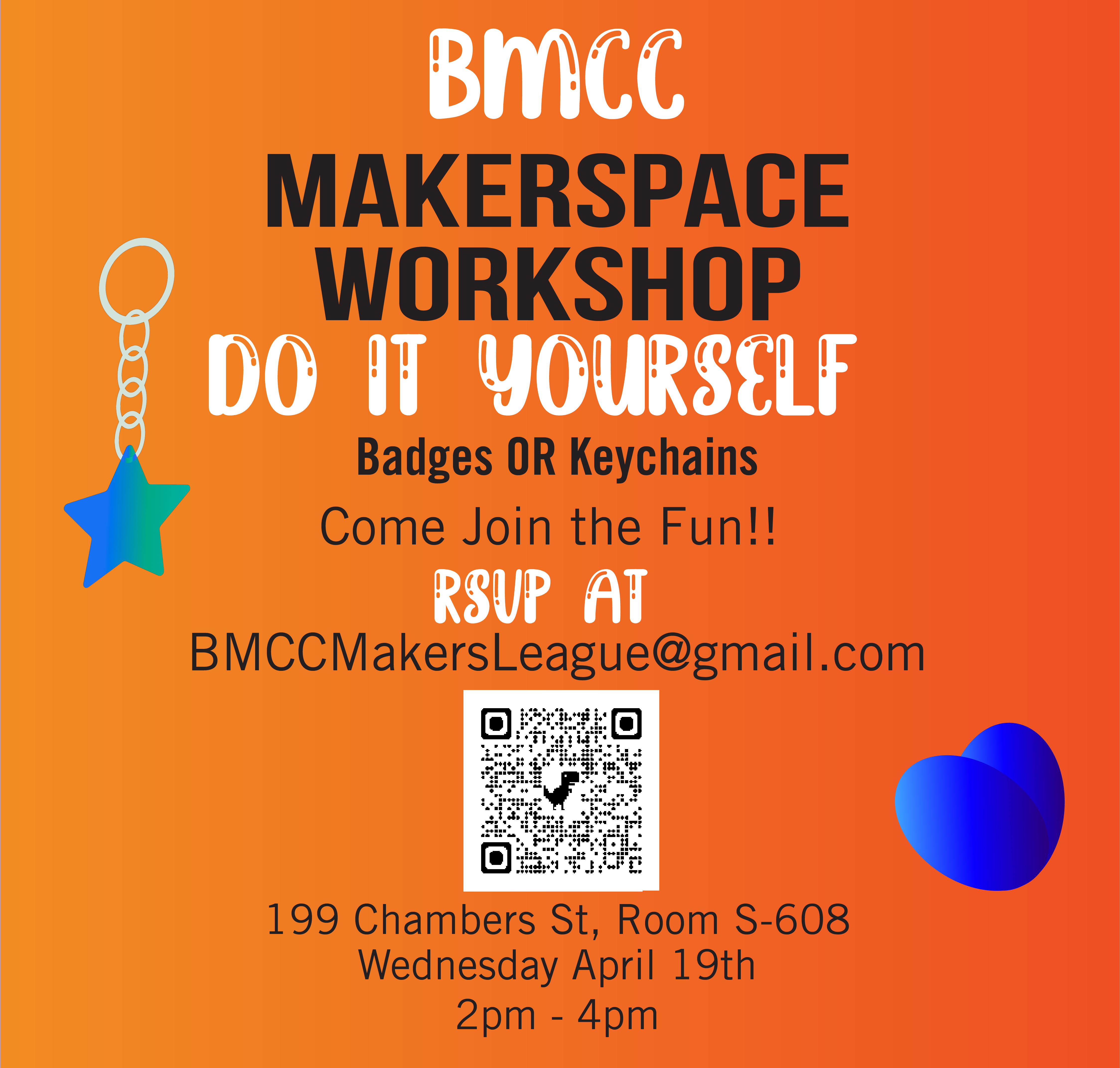
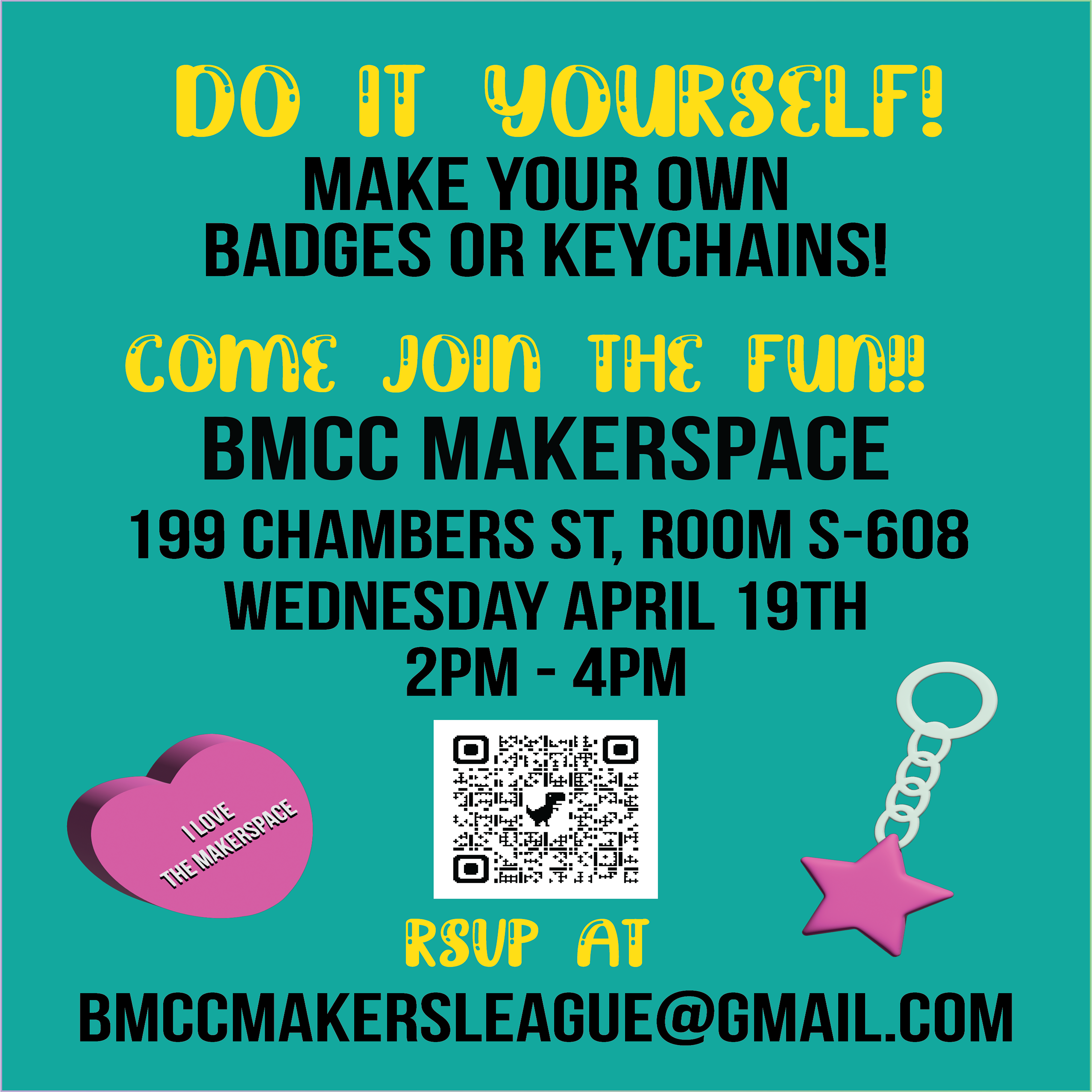
BMCC Makerspace Workshop Flyer Print, 2023, Adobe Illustrator

This workshop flyer was a project that I created through Adobe Illustrator for my campaign project. I used an artboard 8.5x11in for the print version and added guidelines to it to make sure it had enough space but also to make sure it was not cut off when printed. I used two different fonts which are Bebas Neune and Brightly Crush Shine. Bebas Neune is the BMCC Makerspace “unofficial” font and I wanted to incorporate that into the design for the flyers to make it more cohesive. I used the Brightly Crush Shine font for the less important text which is in yellow. While I used Bebas Neue which is more readable for important information such as the location, time, and email address. My classmate created the heart and star and then I used 3D effects to extrude it so it looks more realistic. I added text on the heart to emphasize this is for the Makerspace. I wanted the shape’s color to contrast against the flyer but not overwhelm it which the pink color helped revealed. The QR code links to the BMCC Makerspace Linktree. This poster illustrates hierarchy by having the audience focus more on joining and doing it yourself because I wanted the audience to know that this is interactive and going to be a fun workshop. I wanted images in the flyer that represents what they are going to create which was a badge or keychain- the heart and star. However, I did not want it to distract from the information presented.

Workshop2

BMCC Makerspace Workshop Flyer Web, 2023, Adobe Illustrator

This workshop flyer was a project that I created through Adobe Illustrator for my campaign project. I used an artboard 1080x1080 for the web version and added guidelines to it to make sure it has enough empty space but also to make sure it is not cut off when uploaded. I used two different fonts which are Bebas Neune and Brightly Crush Shine. Bebas Neune is the BMCC Makerspace “unofficial” font and I wanted to incorporate that into the design for the flyers to make it more cohesive. I used the Brightly Crush Shine font for the less important text which is in white. While I used Bebas Neue which is more readable for important information such as the location, time, and email address. I used black and white for the text because I wanted it to contrast against the orange gradient in the background. My classmate created the heart and star and then I used 3D effects to extrude it so it looks more realistic. I added text on the heart to emphasize this is for the Makerspace. I wanted the shapes' color to have a higher contrast against the flyer but I didn’t want it to be brighter. Seeing as blue and orange are the BMCC colors I wanted to incorporate that into this flyer. The QR code links to the BMCC Makerspace Linktree. This poster illustrates hierarchy by having the audience focus more on joining and doing it yourself because I wanted the audience to know that this is interactive and going to be a fun workshop. I wanted images in the flyer that represents what they are going to create which was a badge or keychain- the heart and star. However, I did not want it to get lost in the background so I went with the contrasting color -orange- which also represents the BMCC colors.